There’s a moment every designer dreads. You’ve spent hours crafting the perfect business card — the typography is immaculate, the color palette is on-brand, the spacing feels just right. Then you drop it into a mockup and suddenly… it looks like something printed at a gas station kiosk.
What went wrong?
The card itself is fine. The mockup is the problem.
A business card mockup is more than a presentation tool. It’s the stage your design performs on. A bad stage can tank even a Broadway-caliber performance. And in client presentations, pitches, or portfolio pieces, “cheap-looking” isn’t just an aesthetic criticism — it’s a trust signal. People subconsciously decide whether your work is worth money based on how polished it appears before they even read a single word on the card.
So let’s talk about why mockups fail — and more importantly, how to make yours impossible to ignore.
The Hidden Reasons Your Mockup Looks Unprofessional
Most designers assume a bad-looking mockup is a lighting problem. Sometimes it is. But usually, the culprit is hiding somewhere less obvious.
Flat, lifeless shadows are the number-one offender. Real objects cast complex shadows that shift depending on surface texture, ambient light, and distance from the ground. A single hard drop shadow screams “Photoshop beginner” to anyone who’s held a physical card.
Wrong perspective and angle is equally damaging. If a card is shown at an angle that no human would naturally hold it, the brain detects the wrongness even if the viewer can’t articulate it. Realism isn’t just about rendering quality — it’s about spatial logic.
Then there’s mismatched environments. Placing a luxury brand card on a dirty wooden table, or a playful startup card in a cold, sterile corporate scene — the disconnect undermines the entire concept. Your mockup’s environment should amplify your design’s message, not contradict it.
Finally, low resolution assets are a silent killer. Blurry card edges, pixelated textures, and muddy background materials all signal low effort, regardless of how pristine your actual design is.
The Psychology Behind a “Premium” Mockup
Here’s something most tutorials skip: mockup quality is a form of storytelling.
When someone looks at your business card mockup, they’re not just evaluating the card. They’re imagining the moment of exchange — the handshake, the first impression, the memory it leaves. A great mockup transports them into that scene.
This is why lighting matters so much. Soft, directional light with natural falloff makes a card feel touchable. It creates micro-highlights on paper edges, gentle gradients across the surface, and that subtle warmth that makes printed materials feel real.
Color grading plays a role too. Slightly muted, film-like tones tend to feel expensive. Oversaturated, high-contrast renders tend to feel digital and cold. The best business card mockup templates understand this instinctively — they’re built by photographers and visual artists who know what “premium” actually looks like in the physical world.
Real-World Examples: What Good Looks Like
Let’s ground this in reality. Here are scenarios where a strong mockup made all the difference:
The Law Firm Rebrand — A designer working on a corporate identity package chose a top-down flat-lay mockup showing the business card alongside a fountain pen and a leather notebook. The neutral linen surface, soft overhead light, and organized composition communicated authority and precision. The client approved the concept on the first round.
The Creative Agency Pitch — Instead of a standard three-quarter angle, the designer opted for a dramatic close-up mockup showing the card partially tucked into an envelope, with a blurred bokeh background. It made an ordinary card feel cinematic. The pitch won the account.
The Freelance Photographer’s Portfolio — Using a mockup with multiple cards fanned out at slightly different angles, shot with warm afternoon light, the designer turned a simple black-and-white card into a tactile experience. Prospects on the portfolio site spent 40% longer on that page than any other.
In each case, the design was solid — but the mockup turned “solid” into “stunning.”
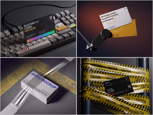
Business Card Mockups on ls.graphics: A Resource Worth Knowing
If you’ve been hunting for mockup resources that actually deliver on quality, ls.graphics deserves a serious look.
What sets their business card mockup collection apart isn’t just volume — it’s intentionality. Every scene feels considered.
- Ultra-realistic rendering — The shadows, reflections, and paper textures are built to mimic real photography so closely that clients frequently mistake mockup presentations for actual print samples.
- Organized, editable layers — Smart object layers mean you can drop in your design in seconds, with full control over individual elements without dismantling the whole composition.
- Multiple angles per scene — Top-down, isometric, dramatic low-angle, close crop — having options within a single pack means you’re not locked into one perspective for every project.
- Color style variations — Light backgrounds, dark moody tones, neutral environments — each scene often comes in multiple color styles so you can match the card’s brand personality.
- Stylish minimalist compositions — Nothing overdone. The props, surfaces, and styling choices are restrained and intentional — the kind of aesthetic that ages well.
- Edit Online feature — No Photoshop? No problem. Their browser-based editor means you can customize and export mockups from anywhere, which is a genuine game-changer for quick turnarounds.
- Generous free library — A large number of free scenes are available to explore before committing, so you can genuinely test the quality before you invest.
It’s the kind of resource that shifts your workflow from “hunting for something acceptable” to “choosing between excellent options.”
Practical Fixes You Can Apply Right Now
Even before you upgrade your mockup library, here are immediate improvements:
- Match light source direction between your card design and the mockup environment — inconsistency destroys believability
- Use surface context intentionally — marble for luxury, concrete for urban brands, linen for organic/wellness
- Add depth with layering — slightly overlap your card with a pen or object to instantly create believable, three-dimensional space
- Avoid pure white backgrounds — slightly warm or cool neutral tones look far more photographic
- Zoom in — close-up mockups often feel more premium than wide shots because detail becomes visible
Small decisions. Big impact.
Conclusion
A business card is a first impression compressed into 85 × 55 millimeters. Your mockup is the first impression of that first impression. Getting it right isn’t optional — it’s the difference between a client who leans forward and one who scrolls past.
The good news is that fixing a cheap-looking mockup rarely requires redesigning your card. It requires better tools, sharper instincts, and a more thoughtful approach to presentation. Resources like ls.graphics exist precisely to close that gap — giving designers access to the kind of scene-setting quality that used to require a professional photo studio.
Present your work the way it deserves to be seen.